Best Practices for Email
Follow these guidelines to ensure your campaigns meet accessibility and design standards and get Web Hub approval every time you submit.
10 Quick Tips for Writing the Perfect Email
Writing the perfect email starts with clear, easy-to-read content and thoughtful design.
- By following best practices for subject lines, formatting, and accessibility, you can ensure your message is effective and engaging.
Here are 10 quick tips to help you craft emails that not only look great but also perform well across devices.
- Use a clear and descriptive email subject line. A good subject line should summarize the content of your email in a way that grabs attention while remaining concise. This helps your recipient understand the purpose of your message before they even open it.
- Never send emails that are only pictures of text (e.g. flyers, posters). Sending text as images can lead to accessibility and usability issues. Many email clients won’t display images by default, meaning your message might not be seen at all. Make sure to format your information as HTML content, this will ensure your message is readable, even if images fail to load.
- Use simple language. Clear, straightforward language makes your email accessible to a wider audience. Avoid jargon or complex sentences so your message is easy to understand at a glance.
- Use headings, paragraphs, and lists. Structuring your email with headings, paragraphs, and lists helps break up the content, making it easier to skim. This also improves the readability of your email on smaller screens, like mobile devices.
- Only use fonts made for the web. Web-safe fonts ensure that your email displays correctly across different email clients and devices. Non-web fonts may not render properly, leading to a distorted or unprofessional look.
- Add alt text to images. Alt text ensures that people using screen readers or those with images disabled can still understand your message. It also provides important context if an image fails to load.
- Ensure proper color contrast between text and background. Strong contrast between text and background colors improves readability, especially for users with visual impairments. Aim for contrast ratios that meet accessibility standards.
- Provide descriptive hyperlinks; avoid phrases like "click here." Strong contrast between text and background colors improves readability, especially for users with visual impairments. Aim for contrast ratios that meet accessibility standards. Descriptive links like "Learn more about the Department of Geology" help the reader understand the context of the new page they may be about to view.
- Do not use buttons such as "Learn More" and "Read More" as they can be problematic for usability. These buttons often lack context for users relying on screen readers, who may not understand what "Learn More" refers to. Instead, write clear, descriptive action links that offer more context such as the link to the Department of Geology, above.
- Make sure your design is responsive on mobile. Many people check email on mobile devices, so your email design should adjust seamlessly to smaller screens. A responsive design ensures that your content is readable and visually appealing, no matter the device.
Email Accessibility
Sections 504 and 508 of the Federal Rehabilitation Act of 1973 and Title II of the Americans with Disabilities Act work together, and along with the Web Content Accessibility Guidelines (WCAG), they set the basic rules for making sure web content is accessible to everyone within higher education.
We want to make sure that no one is left out when it comes to receiving and interacting with our content. Our branded email templates are already built to meet these standards, giving you a great starting point.
Best Design Practices
Use a clear and descriptive subject line so your email recipients know exactly what they’re clicking on.
Emojis
- Know your audience. While emojis can be used in the subject line, they are not always appropriate and can come off as unprofessional.
- Use them sparingly and make sure they are relevant to your content.
Refer to Adding Emojis to Your Subject Line by the MyEmma Support Hub to learn more about when emojis are appropriate and how to use them.
Use semantic elements by structuring your content like this:
- Main Title: Use a title block. Select H1.
- Subheaders and Section Titles: Use a title block. Select H2 or H3.
- Body Content: Use Paragraph or List blocks.
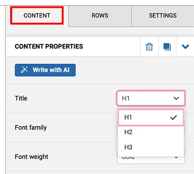
This helps subscribers using screen readers to easily navigate through your email by scanning headers.
- Avoid unusual words and abbreviations in your emails. Write clearly and simply.
- Use larger font sizes. Ensure that all font sizes for your content are at least 14 pixels on desktop and 16 pixels on mobile.
- Set a comfortable line height. Ensure your text is easy to read by setting line height to about 4 pixels more than your font size. Don’t forget to adjust line height when increasing font size for mobile devices.
- Only use web safe fonts that are easy to read.
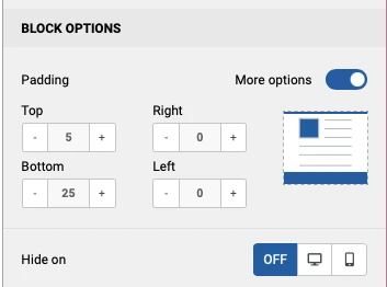
- Utilize padding to add white space above and below paragraphs and avoid placing text too close to the edges of your email.
Images
- Always make sure your email has a good balance of images and text with no more than 40% images.
- Never send emails that are only pictures of text (e.g. flyers, posters). Instead, include all the text from the picture as the body of the text and attach the flyer only if needed.
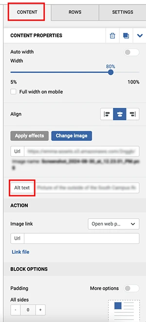
Alt Text
Alternative text descriptions help people with visual impairments understand what’s in your images.
- For each image, provide a clear description or include the text from the image in the Alt text box.
- Avoid starting your description with “Image of” or "Photo of."
-
| Photographs | Clearly describe the image but don't make your alt text too long (e.g. “three students share an umbrella on their walk through the grove”). |
| Logos | Use your unit name as the alt text (e.g. “The School of Applied Sciences at the University of Mississippi”). |
| Decorative Images | Alt text can be left blank on decorative images such as dividers, borders, etc. |
Video and Audio
If the message links to a video or audio file, make sure the external file is captioned and/or transcribed. If a video is captioned, you’ll see a "CC" button or option available on the video player tool bar.
- Use a descriptive label for your links. Descriptive links help all readers, especially those using screen readers or mobile devices, understand where the link will take them.
- Never use phrases such as "Click Here" or the URL on its own.
- Do not use buttons such as "Learn More" and "Read More" as they can be problematic for usability. These phrases don't tell users what to expect when they click the link.
| Undergraduate Admissions Requirements | Click here to learn more about undergraduate admissions requirements. |
| Visit Study Abroad to learn more about our international programs. | For information on international programs, click here. |
Not all audiences see colors the same way, so don’t rely solely on color to convey important information.
- Ensure there’s a strong contrast between text and background colors to accommodate visual impairments. E.g., don’t use black text on navy, navy on red, white on powder blue, etc.
- For a quick check, use WebAim’s Color Contrast Checker to make sure your email meets accessibility standards.
Even if you design an email that appears perfectly on desktop devices, it’s not guaranteed to look the same on mobile.
- Emma will resize campaigns automatically for mobile devices and mobile view can be turned on within the editor.
- You will likely need to make edits to the mobile version as font sizes will likely need to be increased, columns may lose their intended order, images may need resized, and more.
Refer to Creating a Campaign to learn how to hide and/or reorder elements to keep your email content in its intended order.