Manual Modules
Find all the manual modules you can use in Cascade.
Displaying Your Information in Style: How Manual Modules Help You Create Exciting Pages
Manual components allow you to display information on your page in interesting and eye-catching ways.
- These modules let you combine form and function on your page to make it both user-friendly and unique to your unit on campus.
During your webpage planning, take the time to see which manual components can be used on the type of page you are building.
What Manual modules can I use in Cascade?
There are a few different manual modules you can use, which you'll see on the page below.
They include:
- Moveable WYSIWYG
- Checkerboard
- Listing
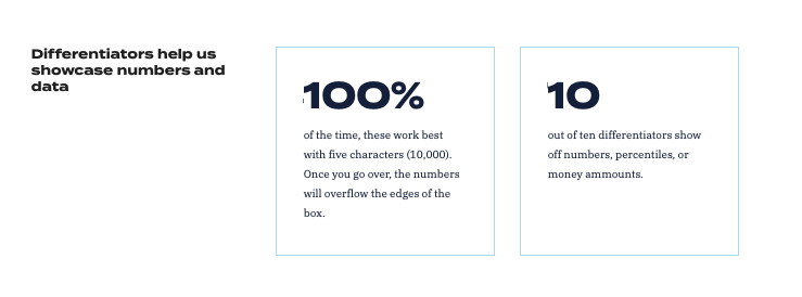
- Differentiators
- Accordions
- 3-Up Cards
- Image/Video Gallery
- Event Feature
Remember: Modules are paired with specific pages to help promote a unique feel for certain types of pages. You may not find all of these modules on the specific page type you're using.
- Make sure to take a close look at each of the modules on this page. They'll give you some information on how to use them to showcase all of your great info!
The Moveable WYSIWYG
The Moveable WYSIWYG (aka What You See is What you Get) lets us showcase textual information while maintaining visual and logical hierarchy through headings.
What can a WYSIWYG do?
WYSIWYGs allow for a wide range of textual styles including:
- Headings 2 through 6
- Bold and italics text styles
- Bulleted and numerical lists
- Images left, center, or right aligned
- Video embeds
- Block quotes
- Tables
Pro tip: You can toggle the background of a WYSIWYG from white to blue and you can add a call out block to the right-hand side.
The Checkerboard Module

Pairing Images with Text
Your images don't have to be directly connected with your text, but images that are related work better than those that seem (or are) more random.
For the sake of visual flow, if your pictures have a direction (faces looking left, for instance) make sure to put them on the right hand side. This way the user will naturally follow the photos' directionality and come back to the center of the checkerboard.

Using a Checkerboard
The Checkerboard can help refine user intent. In other words, you can use it to help send users off on different pathways, like splitting up undergraduate and graduate students, or faculty and staff. That way users can get enough context to know exactly what decision they need to make.
You can also use it to offer information in a visually appealing way. Imagine a page about the Grove. Your checkerboard could give historical, ecological, tail gating, and event information. Each bit of information could come with it's own, unique, and eye-catching photo.
LInking in a Checkerboard
The Checkerboard doesn't have to have links and/or buttons, but if you'd like to add a link or a button, there are two unique options. A primary link and a secondary link. The difference between the two is visual and hierarchical.


A Few Things to Remember
The text block attached to the Checkerboard is restricted to the size of the picture. When the text grows beyond the size of the image, the images become dislocated from eachother and destroy the grid pattern.
Checkerboards also allow you to nest a small image into a larger one. When this happens, keep in mind that a sizable portion of the larger image will be eclipsed by the smaller one. Reserve the large image for environmental or building shots, rather than hiding members of our community.
-
The Listing Module
The Listing module is a great way to display a little bit of information and then give the user a chance to learn more information by clicking on a link. The module doesn't offer any formatting tools for your text, like bold or italics. You'll have to make sure that your copy is clear, concise, and engaging for the user.
Links are required on a listing module -
Creating the List Adds Color
As you add new sections to your list, you'll notice that the Listing module alternates between a gray rectangle and the white background of the page to spruce things up. You can't choose the colors. The Listing module always starts with gray and then goes to white and back to gray.
This is a required link -

Using Pictures
The Listing module can accommodate pictures as well. Keep in mind that the picture for the Listing module is relatively small, so whatever you put in here, make sure that it's visible for the user. Avoid using an image with text, busy graphics, or QR codes.
This is a required link
The Accordion Module
The Accordion module, just like the WYSIWYG, allows you a chance to add some blue to the page.
- If you happen to use a few accordions on the same page, you may want to alternate between white and blue to help the user differentiate between clusters of information.
- When the accordion module is on a white background, the drawers are red.
The 3-Up Card Module

The 3-Up Card Module
The 3-Up Card lets us create three distinct paths for the user to choose from. The perfect combination of images, title, description, and links.
What if I don't want to use a link?
3-Up Cards can also display information without links. If you're information fits into the module and works as a standalone idea (without needing any other contextualization), then go for it.

The Best Images
The best images for the 3-Up Card are ones that showcase our vibrant student body and our beautiful campus. Images with text, QR codes, or of posters and flyers shouldn't be used for this module.
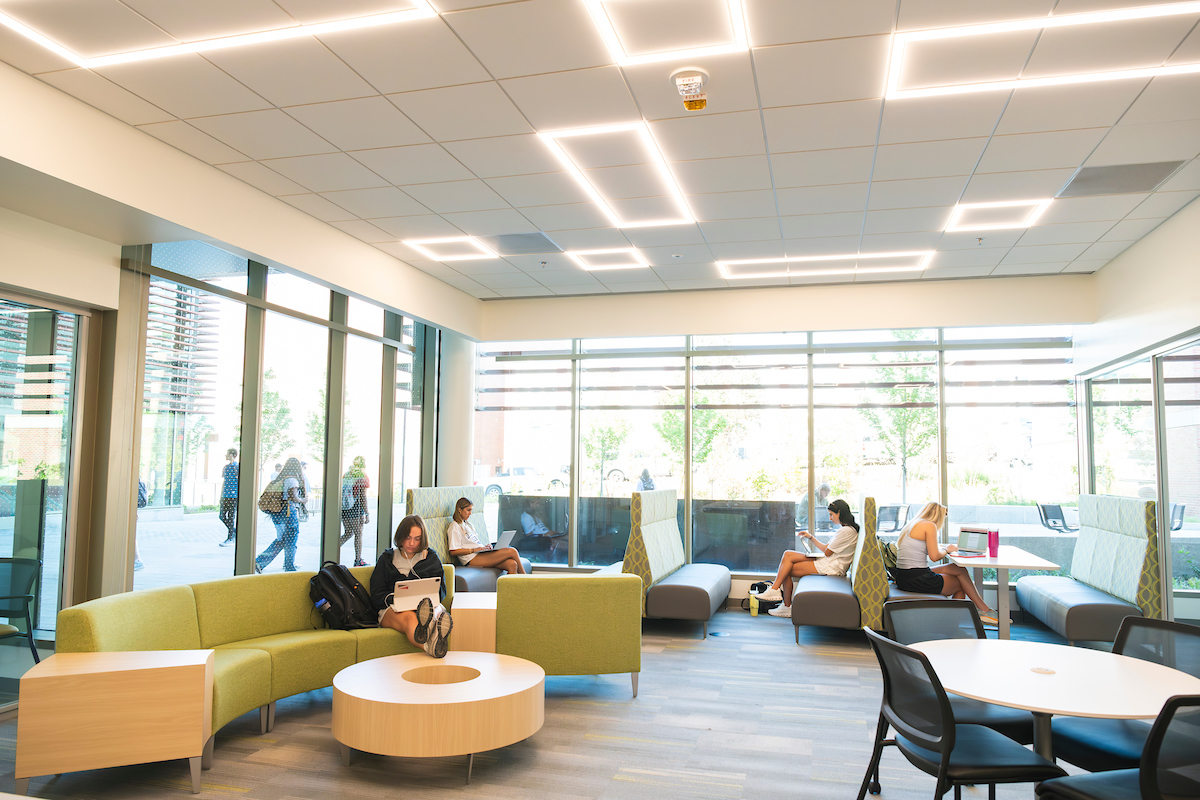
The Image Video/Gallery Module
Images should be compelling and should always come with a caption description.

The caption description helps you tell the story of Ole Miss. Paired with the image, it's a great way to show off how wonderful our university is.

The best descriptions tell a story, rather than simply displaying information. For example, the informative caption description for this image reads "Students walk to class." The story version reads something like, "Students enjoy tree-lined paths throughout campus, making getting to and from class a great chance to take in the beauty of our world-class, award-winning campus."

Another story-driven caption description could read: "Ole Miss is about opportunity. When you're an Ole Miss student, we'll do everything possible to help you understand, prepare for, and attain your dreams. Wherever you're going, we'll help you get there."

Whatever caption description you use, make sure that it is engaging, interesting, and worthwhile.